
Just back from a tour of sundry airports, it is hard not to be struck by the differences between airports in Britain and those countries who take air travel seriously, such as the USA. Scotland is particularly ill-served, having a clutch of under-developed sites scattered from Ayr to Aberdeen, none of which really fulfill the role of national airport.
Contrast American and even continental airport design with the utter chaos that is the heritage of the late-but-unlamented British Airports Authority. Compare, for example, Copenhagen with Edinburgh, both serving capitals of modest 5m countries at the periphery of Europe.
While Edinburgh (EDI) boasted of handling 4% more passengers to reach 10.2m, Copenhagen (Københavns Lufthavn CPH) grew by 6.5% to 25.6m passengers last year. Contrast the layout of its single terminal with that of EDI below

Map of CPH Gates (above) with EDI gates (below—Note the lack of piers).

Not only does EDI lack the more flexible and efficient pier system to accommodate aircraft and ease access to them but many of EDI’s gates are not equipped with jetways, forcing arriving passengers either onto crowded airside buses or on a short walk. Both lead outside and expose passengers to our driech weather by way of welcome.
All this is despite a claimed £260m investment over the last decade and a similar amount promised over the next decade. Certainly there have been improvements. But almost all have been in airport operations (new control tower) and ways of parting punters from their money (multi-story car park and much expanded duty-free and shopping area). That’s what you get when you privatise your airports and don’t pay attention.
More importantly, EDI may boast New York as a transatlantic destination in its top ten (NWK) but CPH flies twice as many passengers to New York and almost as many to EDI’s main destination of London
Perhaps it is unfair to take smaller airports as examples of the best a country has to offer. What about the top two airports in the UK (Heathrow and Gatwick), as compared to the top two in the USA? In the same year as above (2014) Atlanta (ATL) grew 2% to 96m passengers and retained the top spot in the world (beating Beijing’s 86m) and Los Angeles retained its 6th world ranking by growing 6% to 70m.
Heathrow (LHR) did hold on to the 3rd spot with a 1.4% growth to 73m while Gatwick (LGW) was still way down in 36th place, despite a 7.6% growth to 36m passengers. Ten other US airports beat this, including San Francisco (up 4.8% to 47m). Interestingly, Singapore (SIN), a country not much bigger than Edinburgh, was in 16th place with 54m passengers.
But, just as with EDI and CPH, contrasting the structure of either UK airport with practice elsewhere shows both LHR and LGW is a poor light and underscores the lack of strategic thinking and investment in either.
Layout of Los Angeles Airport (LAX)
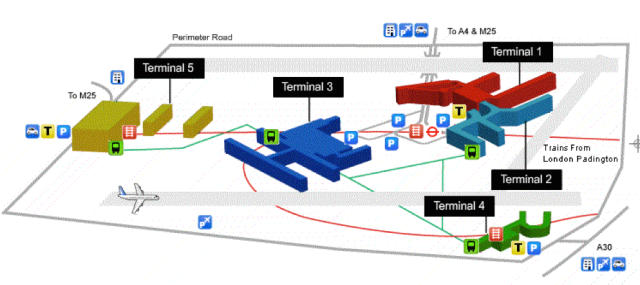
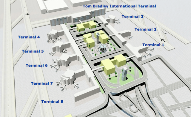
Layout of London Heathrow Airport (LHR)
Contrast the two maps above and what strikes you? That LAX is laid out to a plan. That plan has been in place since the 1970’s when there were only six terminals. It offers easy traffic flow around all eight terminals with through traffic unimpeded in the centre and shuttle buses connecting each terminal in a matter of minutes. It is well signed which airline leaves from which terminal; even if you miss it, it’s only five minutes round the circuit again.
By contrast, LHR looks like a Lego set that has been dropped on the floor. Though it should have a huge advantage in being connected to both the Tube and to mainline rail services to Paddington, connections are partial and illogical. Getting from one terminal to another is bewildering. It often involves a crowded bus ride, twisting through the air-side bowels of the place that no passenger at LAX would ever see.
Is this a fluke? Not at all. Look at JFK or ATL and you see the same logical pattern imposed, despite the US being an even more free-market place than the UK. Contrast the second airport in UK with the second airport in California and the disparity in long-range thinking repeats itself.

Map of San Francisco International airport (SFO)
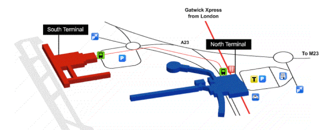
Map of London Gatwick airport (LGW)
Even allowing for the scale difference (47m vs 36m), SFO is laid out in a sensible and easily understood manner. Traffic flow is similar to LAX around all terminals and shuttles call at each in sequence. It even has a much used DLR-style shuttle to not just all terminals but to parking and car rental sites. There is even a BART station for connections to bothe the City and the rest of the Bay Area.
LGW does also boast a DLR-style shuttle but built such that expansion to any future third terminal is difficult, if not excluded. But LGW’s greatest sin is as illogical a set of gate numbers as you could dream up. Those sub-40 are in the South Terminal. The North Terminal has 40-56, 101-113 and 555-563. What happened to the rest is unclear. But then they really mess with your head by having 55A-55G, which happen to be at the opposite end of the airport from (and easily confused with) 555-559. The reasoning eludes me.
The recent political spat about Westminster not coming up with a decision on another runway for London rather misses the point. Why throw good money after bad with their execrably poor airport layouts? Whoever dreamed up London’s airport strategy must have been fleein’ not flying.
If the Scots had any sense, they’d build their answer to Copenhagen on a rail line near Larbert and close EDI, GLA and PIK. This could then act as our single hub, as CPH does for Scandinavia. It would steal transatlantic flights from hopelessly muddled LHR/LGW and provide Scotland with the kind of links that would mean far fewer of us would need to get lost in the present and future time-wasting tangle that is London in the first place.

Pingback: We’re On the Way | davidsberry
Pingback: Third World Gateway | davidsberry